Balanced Essentials is an Non-Profit created in order to “balance” the curve on hygiene poverty in the U.S. In order to tackle this issue, Balanced Essentials aim to provide individuals with hygiene products such as: Soap, Deodorant, lotion, feminine products, and dental products.- Cleaning supplies such as : Multi-purpose cleaner, laundry detergent, Dish detergent, bleach, and hand sanitizers. - and Essential clothing such as: underwear, t-shirts, socks, formal wear and educational friendly clothing.
Brand Identity . Packaging Design . Retail Design
Branding
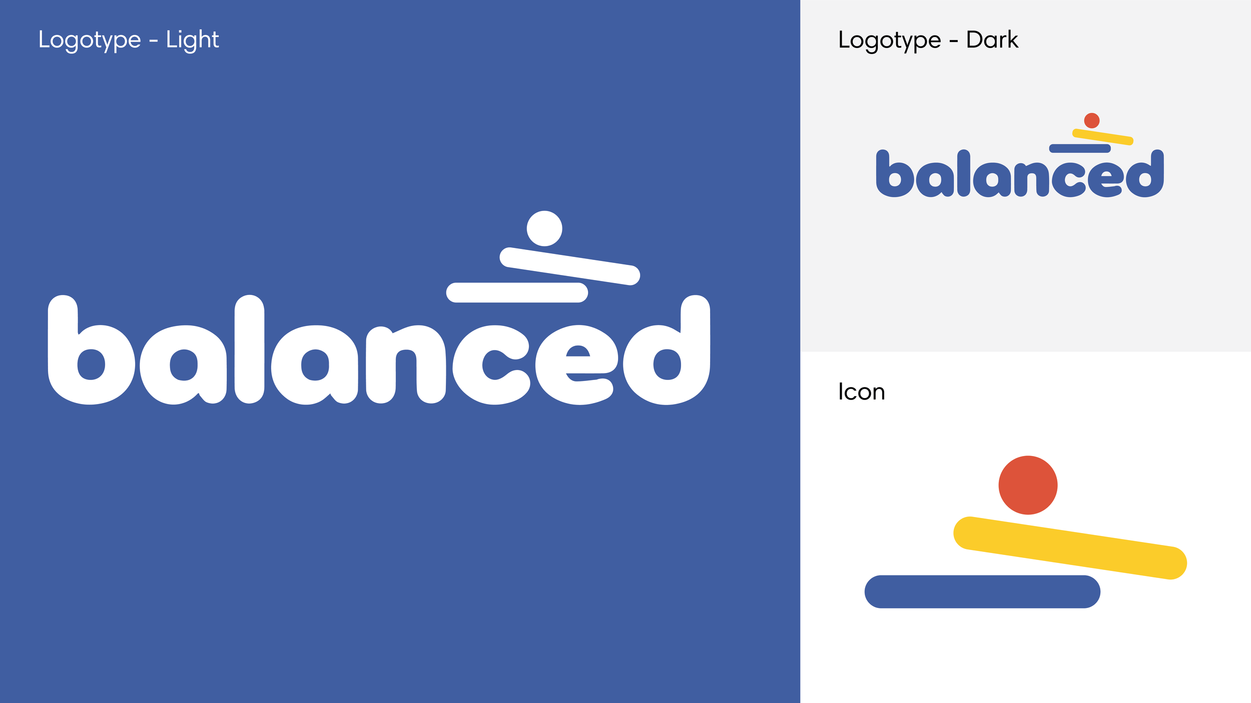
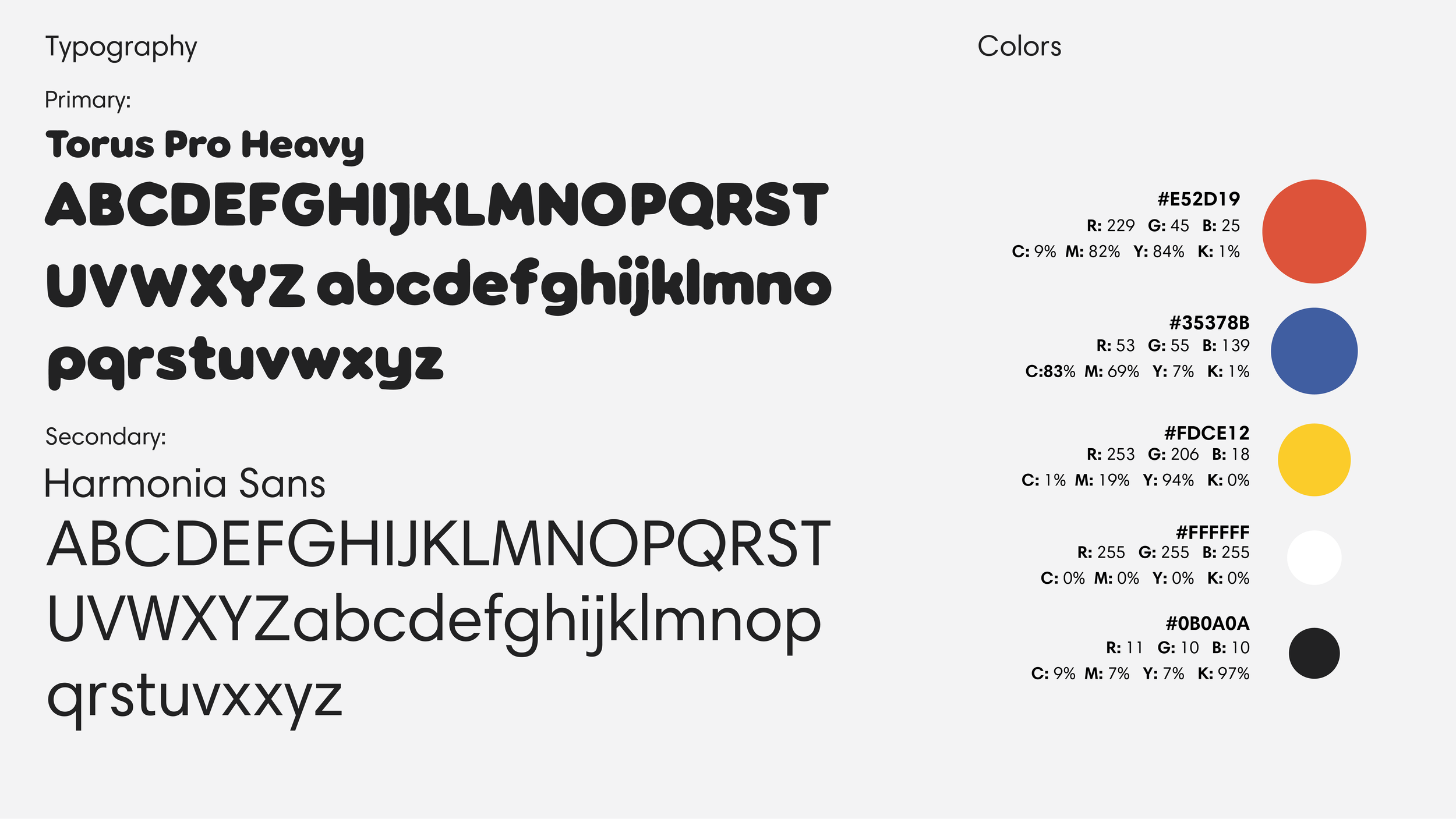
The idea was to create branding that amplified the mission of “Balanced Essentials”, while maintaining consumer privacy. The brand icon recreates the idea of imperfect balance, while the brands use of primary colors evokes childhood feelings of curiosity and exploration.
Packaging Design
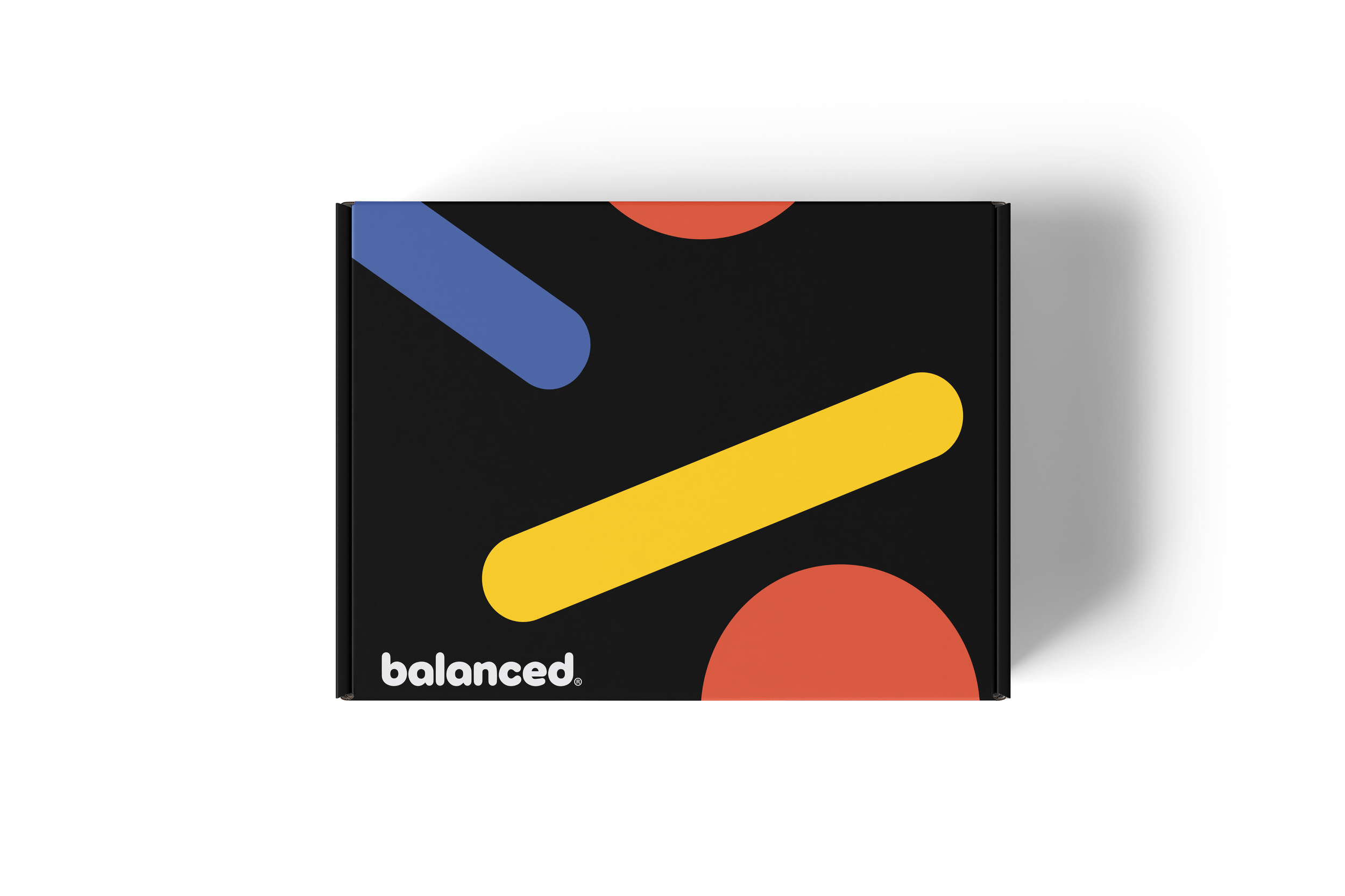
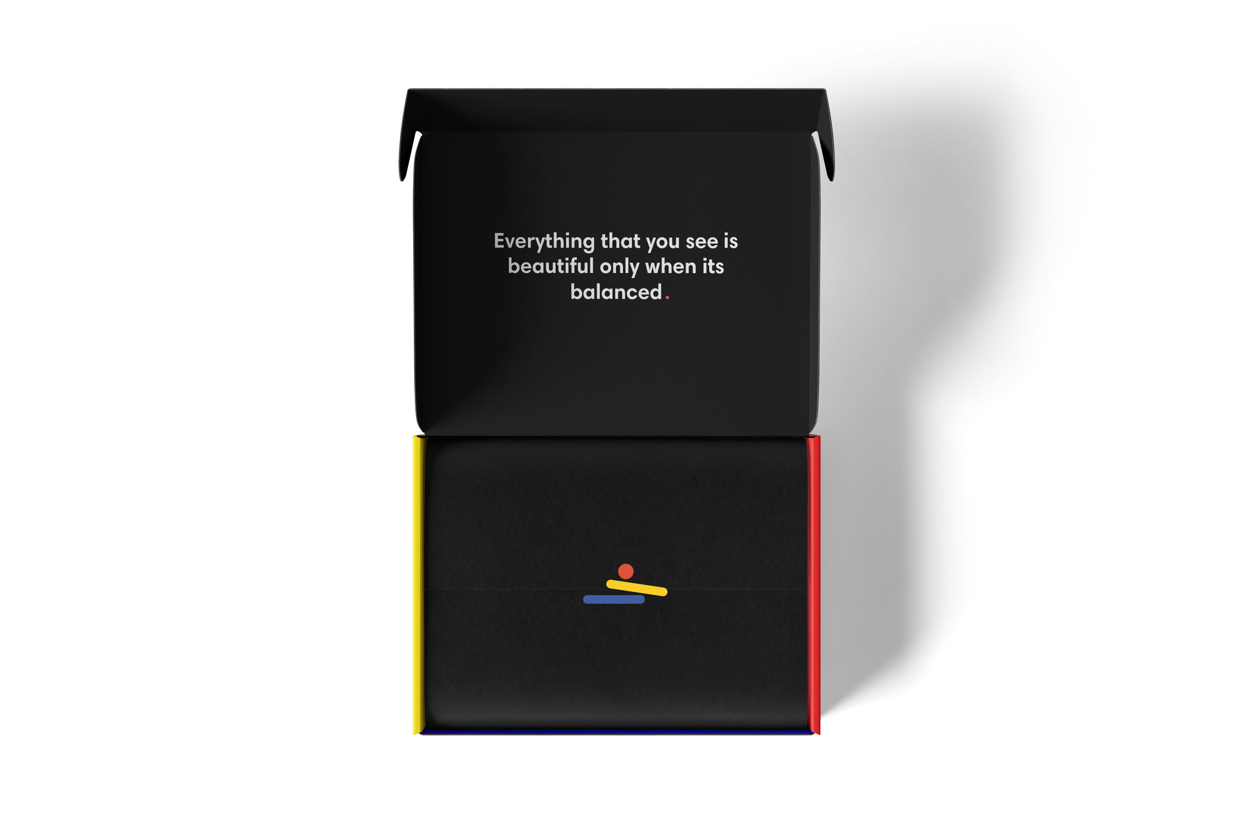
“The Box '' allows for you to receive all your needs right at your doorstep. From soap to socks, the box allows customers to pick what they need and exclude what they don’t. When designing “The Box” the biggest goal was to create a secluded and cool way to receive aid, without worry of judgment. The result is, a black base with an overprinted pattern created out of our identity, and color blocking inside utilizing the brand colors.


Retail Design
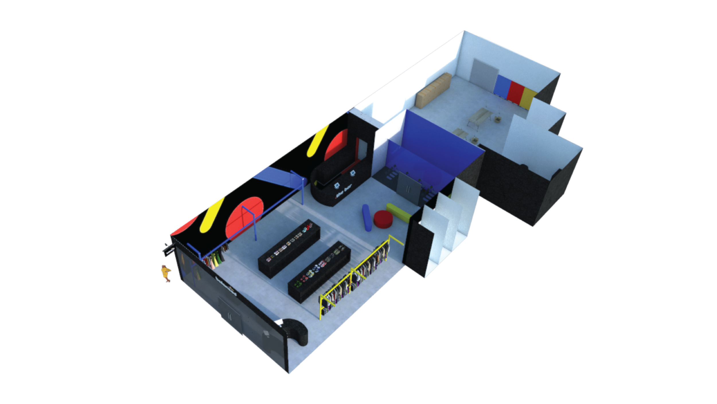
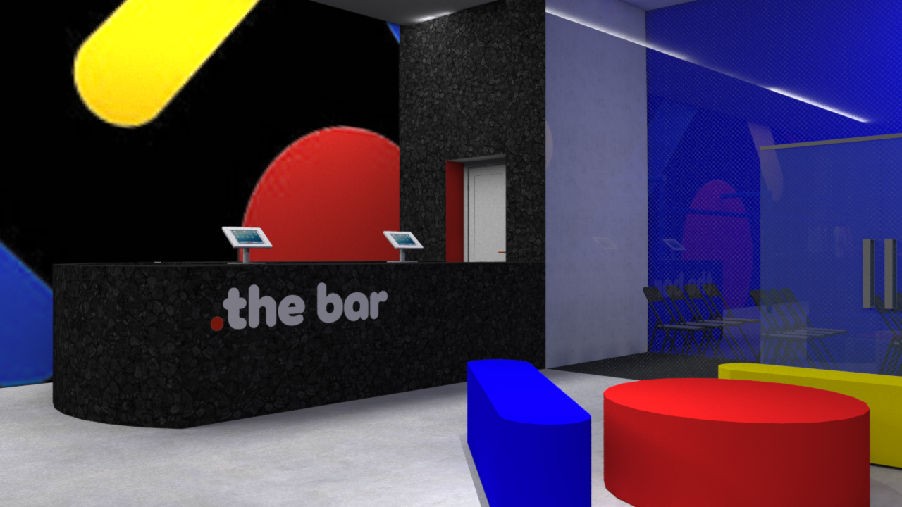
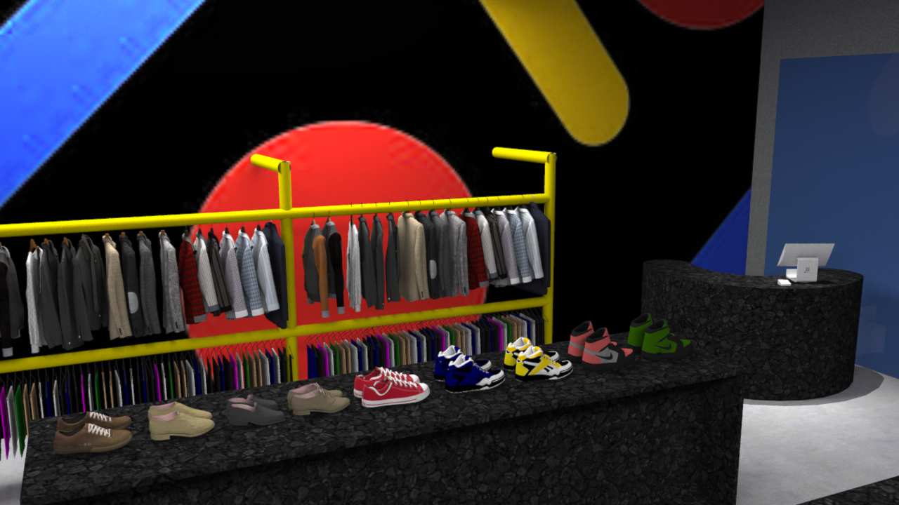
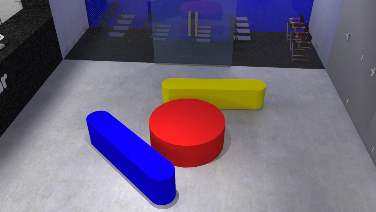
The retail space, designed from the ground up using SketchUp, allows for a physical shopping experience with a slight twist. When conducting user testing we found that not only does 22% of consumers prefer an in-person method, but also that our audience could lack a safe shipping address and/or would like direct access to product without the wait.
